Coolblue | 2020
Creating a voice shopping experience for the visually impaired
Shopping online is an easy and enjoyable task for most of us. But what happens when you’re visually impaired or blind? Online shopping suddenly becomes nearly impossible with screen readers unable to filter out what is important for the user and reading everything onscreen. In this project our team strived to create a voice interface for Coolblue’s online webshop.

The case
The web is said to be designed for everyone. Yet decennia after it’s first launch, the worldwide web is still not fully accessible for many people on the globe. People with a visual impairment are one of many that still struggle each time when they try to complete simple tasks such as browsing.
Our team was tasked to develop an improvement on one of these simple tasks; online shopping. Together with Koninklijke Visio, a Dutch institution that helps people with an impairment, we would co-design a voice interface that made it easier for visually impaired people to do online shopping.
Design challenge
“How can we improve the digital shopping experience for the visually impaired and blind people through a voice user interface?”
The end result
After weeks of research and development our team arrived at a voice interface prototype for the Coolblue webshop. This prototype was designed to simplify the webshop into a digestible conversation that users could use to browse the entire catalog. When we first started the project there were no set deliverables that we had to make. But as we went on we realized that there were multiple deliverables needed to demonstrate our prototype. Such as a conversation flow, conversational guidelines, content guidelines, a restructure of the information architecture, and a promo video that brings it all together.
Research
We had a total of six weeks total to complete the project and deliver a prototype. Due to this lack of time we had to be creative in how we’d conduct our research. Our goal was to build as much empathy as possible in the shortest possible time. As a result we managed to complete a couple milestones that gave us a sufficient insight on our main question “how do visually impaired people experience the worldwide web?”.
💻 1 Live demonstration of visually impaired online
During this demonstration our team observed how someone with a visual impairment tried to complete simple tasks. Our observations helped us build empathy and use that to change our design attitudes to be more inclusive.
📝 1 Workshop with two visually impaired
During these workshops we would interview them on their biggest obstacles online, what their needs are, possible solutions that they would like to see.
✍🏻 1 Workshop about inclusive design
This workshop was really insightful because it gave our team practical guidelines and tips to follow so we could design in a more inclusive manner.
🚶 1 User trip to Coolblue store
Since we were creating a different interface for the webshop, we thought it was best to take a user trip to the physical store and see which things we could replicate into the voice interface.

A depiction of how screen readers read inaccessibly coded webpages
Key insights and pain points
“The smallest online tasks that seem normal to most, can be giant obstacles for someone with an impairment”
💥 Information overload
A lot of online sites are too noisy for visually impaired to visit. Due to the information overloading of their screen readers.
🔑 Consistency is key
Visually impaired people rely a lot more on their ability to memorize structures. Websites should aid their memorization
🏷️ Correct semantic labelling is essential
The primairy tool that visually impaired use is a screen reader. A device that relies fully on the semantic code of a website. So this code should be coded accordingly.

Three of the six conversation flows we designed
Use cases
Building a complete voice interface concept that would be up and running within six weeks wasn’t possible. We had to choose which use cases the target audience would most likely encounter and create our concept with those cases. Each one of our team members had a single use case that they were responsible for, but generally we assisted each other where needed.
🛒
Browsing products
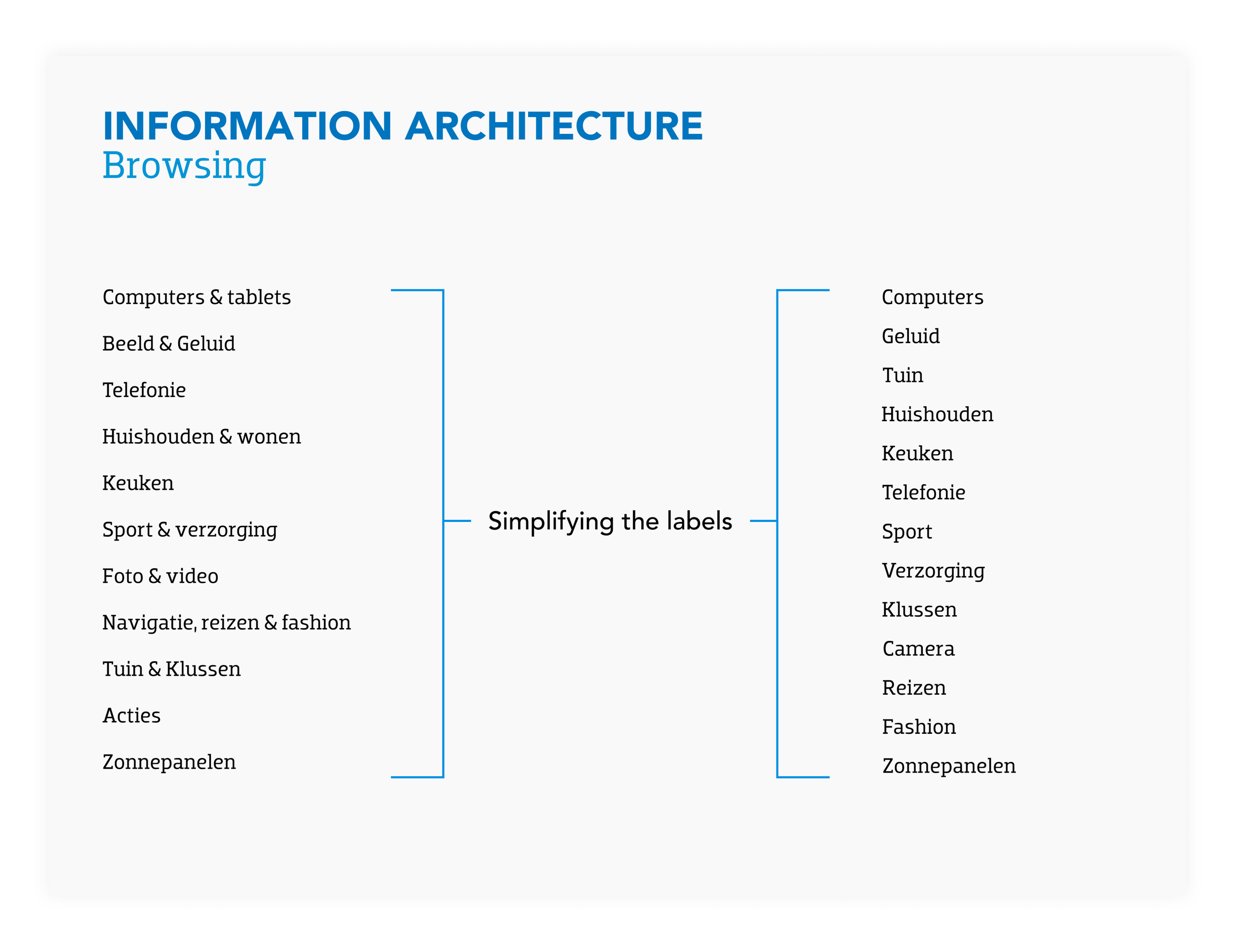
Thomas Koel was responsible for creating the converational flow of how a user could browse through all the available products. The restructuring of the information architecture was necessary here.
👉
Choice guide
Naomi Cheung was responsible for creating a choice guide. The feature that resembles the instore sales associate that offers you assistance whenever you have questions about a product.
⚙️
Filtering & sorting
Bas de Bruin was responsible for creating the filter & sort feature. This gives the user the ability to see certain products before others.
🪞
Comparing products
I was responsible for creating a comparing feature within the voice interface. Giving users the ability to put products side by side with others.
👩💻
Configure product
Lisa Smink was responsible for the capability to configure your product once you’ve decided to purchase it. Such as additional custom products like phone cases with a phone purchase.
💾
Save a product
Lisa also developed the ‘save’ feature in the interface. Where users could flag products to view at a later point.
Finding
We discovered while designing the conversation flows that we were slowly creating guidelines and rules. From that point on we really focused on properly documenting these guidelines, so Visio and Coolblue could use these in future products.
Content guidelines
While creating the conversation flows of each use case we noticed that these guidelines differ for each stage of the funnel. Very much like the conventional purchasing funnel, with each slice of the funnel representing the consumer to be at a different stage with different needs. Our content guidelines very similar, but put more emphasis on how the content should be presented in the voice interface.
When users are exploring and browsing they don’t require in-depth detailed information on each product, yet when selecting a products they do. By setting these parameters we could create consistent conversational flows that took in account where each user might be in the funnel.

How the content should change depending on where you are in the funnel

Content guidelines that we created for developing content for voice
Finding
Cognitive capacities are much more limited when audio is the only channel to absorb information from. Due to this limitation you need simple and easily digestible labels.
Renaming and restructuring of IA
Designing for a voice interface limited our playing field. Visual interface allow you to create visual hierarchies and digest a lot of information in a blink of an eye. Due to the limitations of hearing we had to rethink how to present the information architecture. By diluting the labels that the Coolblue webshop had to simpler names, we could prevent the user from suffering from information overload.
The endproduct 🥁
