ING | 2021
Personalised banking interface
ING is the largest bank in the Netherlands, with over eight million accounts. Ranging from business to personal banking, young to old, Dutch and expats. This is great for business but makes it hard to create a personalised experience for each individual. This case study is about designing a personalised banking interface specifically for students.

The Ask
ING always aims to create meaningful experiences for their clients and came to us (me and my two other teammates: Robin Kuipers and Hannah Joosten) with a problem. ING has a huge client base, but they were all interacting with the same app and same interface, while each customer segment had different needs. So, they wanted us to create a personalised banking interface for one of their three given consumer segments. Out of which we choose students.
Project goals
Identify the financial behaviour of students
Identify possible pain points within the current app for students
Develop a new personalised interface based on these findings
Validate the new interface design
Research
It was very important for this case that we conducted sufficient research on the user, because the entire endproduct was going to be based on our findings. ING already gave us a couple of hints on what differentiates students financial behaviour from other segments, but we had to see for ourselves. We initially started by documenting all the assumptions we had about financial behaviour of students and also added hypothesis’ through desk research. Once we had a list with all of the assumptions each of us went out to conduct interviews with the target audience. The criteria was anyone who was studying between the age of 18 - 25.
During these interviews we asked open questions such as: “what feature in your current banking app do you use the most” and “which financial goals do you wish to achieve, and can your bank contribute to this goal”. Our goal was to really get a grip on how students use their money and understand thee relationship with their banks. This understanding would later on allow us to create a truly personalised interface. We had a lot of findings after combining our research, consisting of market research, interviews and additional desk research. We used an affinity map to try to cluster the findings and see where reoccurring patterns could be found. These clusters were then later merged into key findings.

Clustering of insights on Miro
Ideation
Our conducted research was showing a clear direction in which we were heading. The target audience was in essence lacking insight into their personal finances and this resulted in multiple financial struggles; such as occasionally not being able to make ends meet and not being able to reach financial goals. Our logical next step was to take this data and convert them into ideas and prototypes. So that’s what we did. We held a brainstorm session where each individual jotted down their feature, idea, solution, and we filtered them all down to four solutions (or features that would later become a single solution).
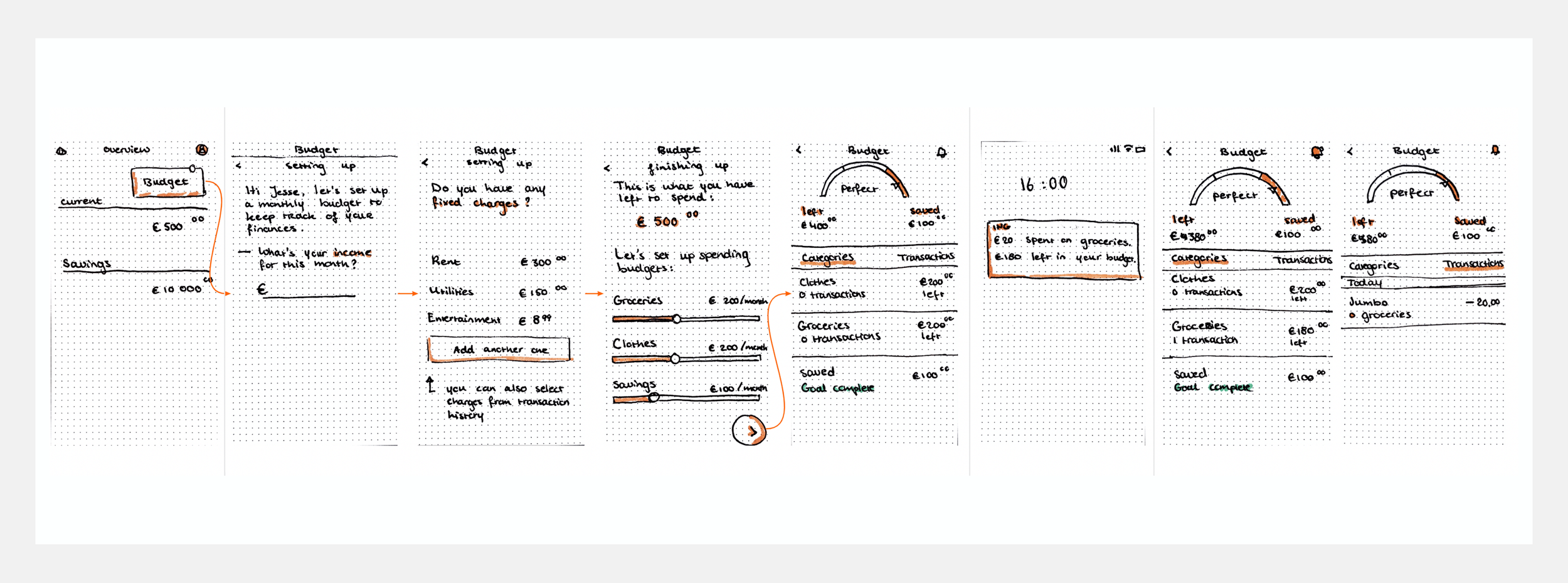
Afterwards we sat down and sketched out what we thought would be the first sketch of the solution. You can see the sketches below. The idea was to create an interface which would stimulate students to create budgets. Based on the students’ performance within the budgets the app would give insights on their financial spending. Giving indications on what they’re spending on and how much. Developing some sort of a financial conscience.

Creating and picking concepts
Initial paper prototypes
Testing and iterating
Once we finished our first sketch of the initial idea we had to test it. We did two sessions of quick paper prototype testing with users in our target audience. The feedback we received was plenty enough to start iterating on the next prototype. This cycle of testing and iteration went on for multiple weeks to come and you can see some of the results below. In the later stages we also used other methods that gave us inspiration for upcoming iterations. Methods such as customer journey mapping, setting up a service blueprint, creating persona’s, developing a value proposition, storyboarding, and doing a market analysis.

Service blueprint mapping on insight view’s use

Customer journey mapping on insight view’s use

Iterations of Insight View
The final product
After sufficient testing and iteration we had developed, what we thought, was an interface that met all the criteria of the briefing and solved the pain points that were identified in our research. An interface that helped students with staying in budget, achieving financial goals, and most importantly; gave them insight on where their money was going to. As a bonus point we ended up creating an interface that was not only tailored to students, but practically any individual who was having a hard time managing their finances and was having money problems as a result. ING bank very happy with the solution we came up with. Below you can find the walkthrough video and some of the most important screen designs.
See documentation here →

Learnings
Conduct sufficient research before ideation: I believe that our project started off so well because of the amount of research we had conducted. This research was not only the foundation of our endproduct, but also a collection of data to come back to whenever we felt in doubt about design decisions. This definitely helped in guiding us through tough choices.
Prototypes don’t have to be polished to be tested: there were multiple occasions during this project where we said that the prototype “wasn’t ready for testing” because we thought it needed some tweaks. But in reality it was the best time to test. All the tweaks could just be added to the next iteration on top of the feedback from testing. Testing too early is better than testing too late.